✐ PROJECT SCOPE
✼ Context: Personal project (fictitious client – Caprabo)
✼ Timeline: October 24 – December 24
✼ My role: UX Researcher and Designer
✼ Methods: Heuristic evaluation, deep interviews, competitive analysis, ethnographic observation method, workshop facilitation, storyboards, journey maps, personas, usability testings and prototyping
✼ Tools: Figma | Miro | Meet | Optimal | Digital sketching

Project overview
Caprabo, a Spanish distribution company, has been part of the Eroski Group since 2009. Under the Caprabo brand, Eroski operates a network of over 300 supermarkets across Catalonia and Andorra. Headquartered in Barcelona, Caprabo provides nearly 6,000 jobs through its extensive presence in Catalonia’s four provinces.
Despite its reach, the current design of the Caprabo mobile application has faced significant criticism for its poor user experience, cluttered aesthetic, and various design flaws. These issues have not only frustrated users but may also be impacting the company’s overall revenue.
As a frequent Caprabo user, I have personally experienced the challenges of navigating their app. This case study aims to address these problems by identifying the app’s key usability issues and proposing a comprehensive redesign of its interface. Through user research and market analysis, the project seeks to create a more intuitive, navigable, and user-friendly mobile application for Caprabo customers.
Main problem

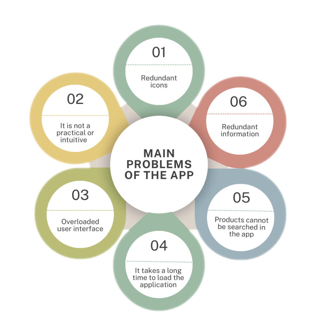
The current user experience of the Caprabo mobile application is hindered by poor navigation, a lack of responsive design for different devices, redundant repetition of icons and sections, and overall disorganization of its components. These issues contribute to user confusion and result in an unpleasant and frustrating experience.
How could I improve the mobile app experience for Caprabo’s regular customers to make it more intuitive and pleasant?
Research
The main objective of this redesign is to make it easier for users to navigate the Caprabo mobile application, making it as self-sufficient as possible so that they don’t have to resort to opening its website through the browser. In addition, it is also intended to make it more intuitive and practical so the users have the feeling of having more control over their actions and know where they are and what they are doing all the time.
User participants and research methods
Since some regular users of the Caprabo application are people I know, I decided to conduct interviews with six users to gain deeper insights into how they interact with the app and identify areas for improvement.
Given the limited time available for the project, I focused my efforts on these six interviews to gather valuable feedback efficiently.

Following the interviews and in order to gather more information in the user’s context, I used the ethnographic observation method with them simulating a common situation in which they use the Caprabo platform. I asked them one by one to open the platform and navigate through it in the same way they usually do, with the aim of detecting in each case the different aspects of improvement that arose when they accessed to different sites and ensure to what extent they satisfy the requirements of different users.

User personas


Main problems of the current application


App Store reviews
I have collected feedback from various Caprabo app users in the App Store to use it as a reference point to meet my objective and to be able to focus this improvement project in the best possible way.
I consider this an opportunity to generate a significant impact by creating a design that truly resonates with users and improves their shopping experience.


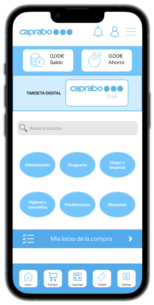
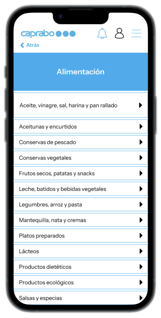
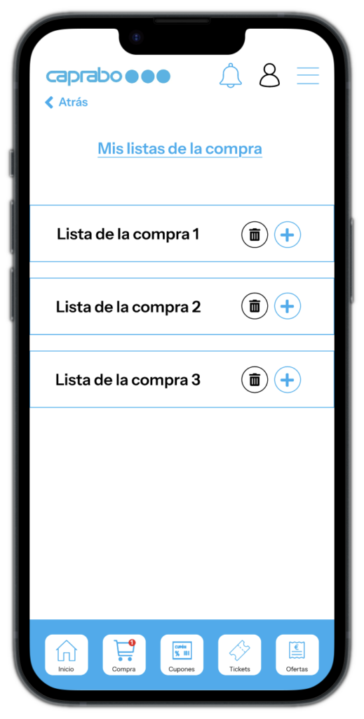
Current screens


Redesigned screens